Its called “Hunters of the Waste”, its had many incarnations and i was wondering if anyone is interested in it before i publish. Attatched to this is a snippit. I just need feed back and i was hoping this community could give me the gusto to actually publish
4 Likes
It looks great. That font is really tiring on the eyes. It’s great for headers, but if you’re trying to convey information that you want people to soak in, go for a less squiggly one.
Yes sir, thank you
1 Like
Agree with the fonts comment. But I’m totally digging the vibe. Great work!
1 Like
I have to agree with Alex, this font is barely readable to me. It is much too thin.
For a long read, which I imagine a lot of us do upon getting a new game we intend to play/run, it would stop me in my tracks.
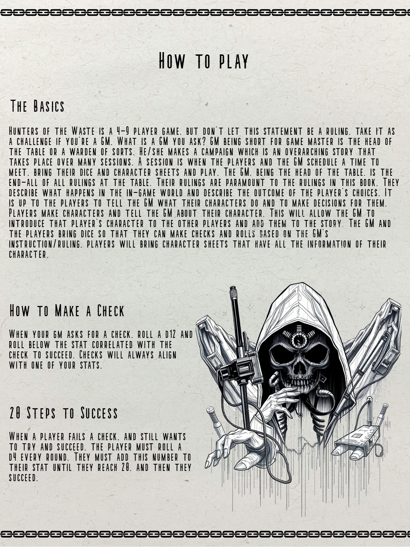
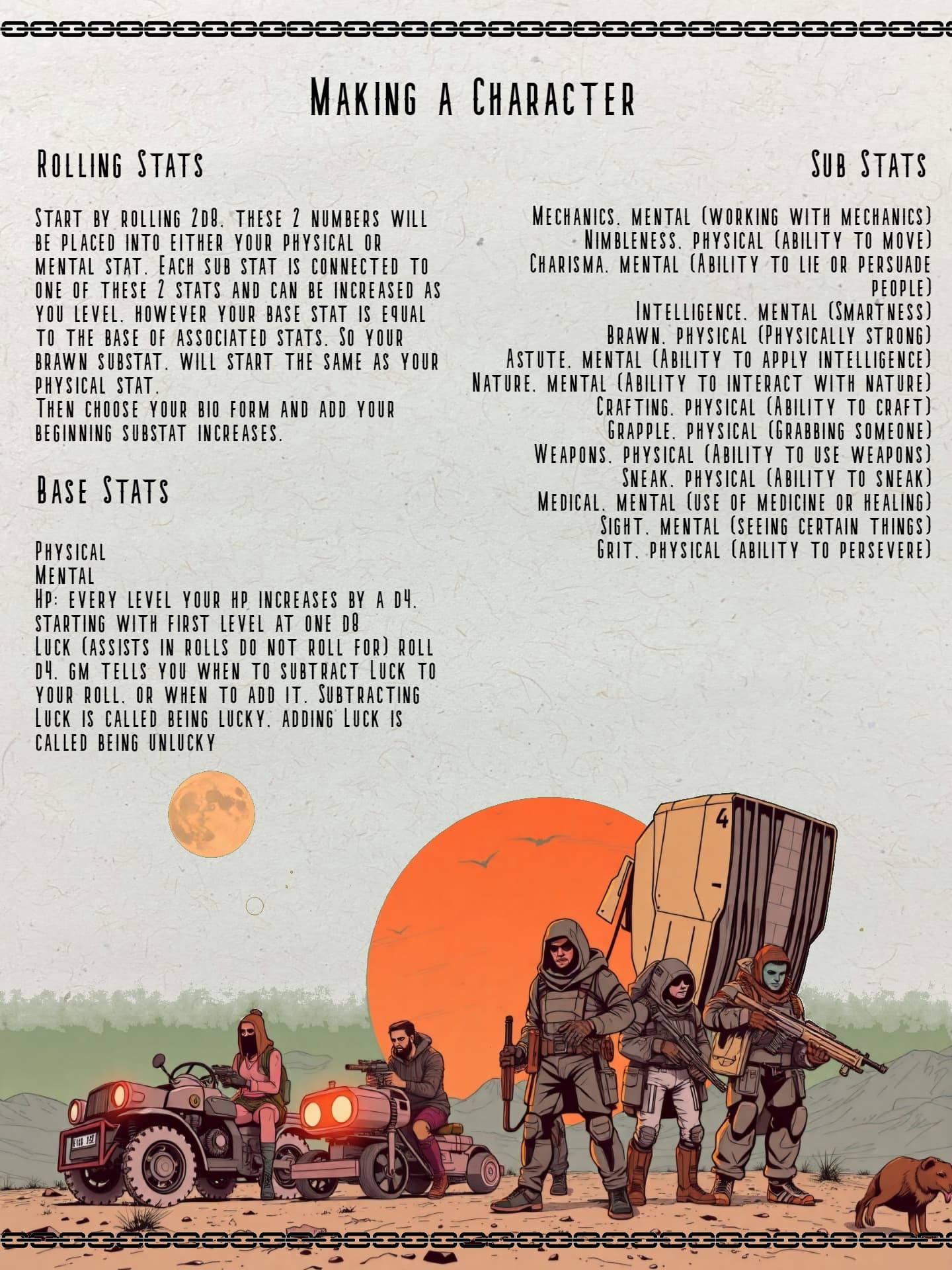
I am very interested in the vibe the images and the few pages give off, though. Looking forward to seeing another game coming from the shield wall.
1 Like